Free Daily Report Explained

Every day we will provide a detailed report on how to read market positioning and key levels by looking at option data. We offer a Free Daily Report that you can receive by simply subscribing to our mailing list.
Every morning at 6.30 EST (NY Time) we will send the updated report that will provide you access to our data and models on the SPX, QQQ and VIX.
This article describes step by step every section in details. Let’s start!
What can you find in the Free Daily Report?
The report is very detailed and will provide you access to:
- Daily Note. The Menthor Q Daily Note will provide you with a Macro, Momentum or Liquidity update for the day.
- Gamma and Liquidity Levels on the SPX Index
- Gamma and Liquidity Levels on QQQ (Technology ETF following the Nasdaq)
- Gamma and Liquidity Levels on the VIX Index
By signing up to our mailing list you will receive the report via email as well as being able to access the data on our Free Discord Server. Sign up to receive the Free Daily Report.
Now let’s look at the data and how to use it.
Menthor Q Daily Note
We will provide you our daily research looking at the market from a Macro, Liquidity and Momentum point of view. We will highlights the main topics for the day and provide you our commentary on the market.
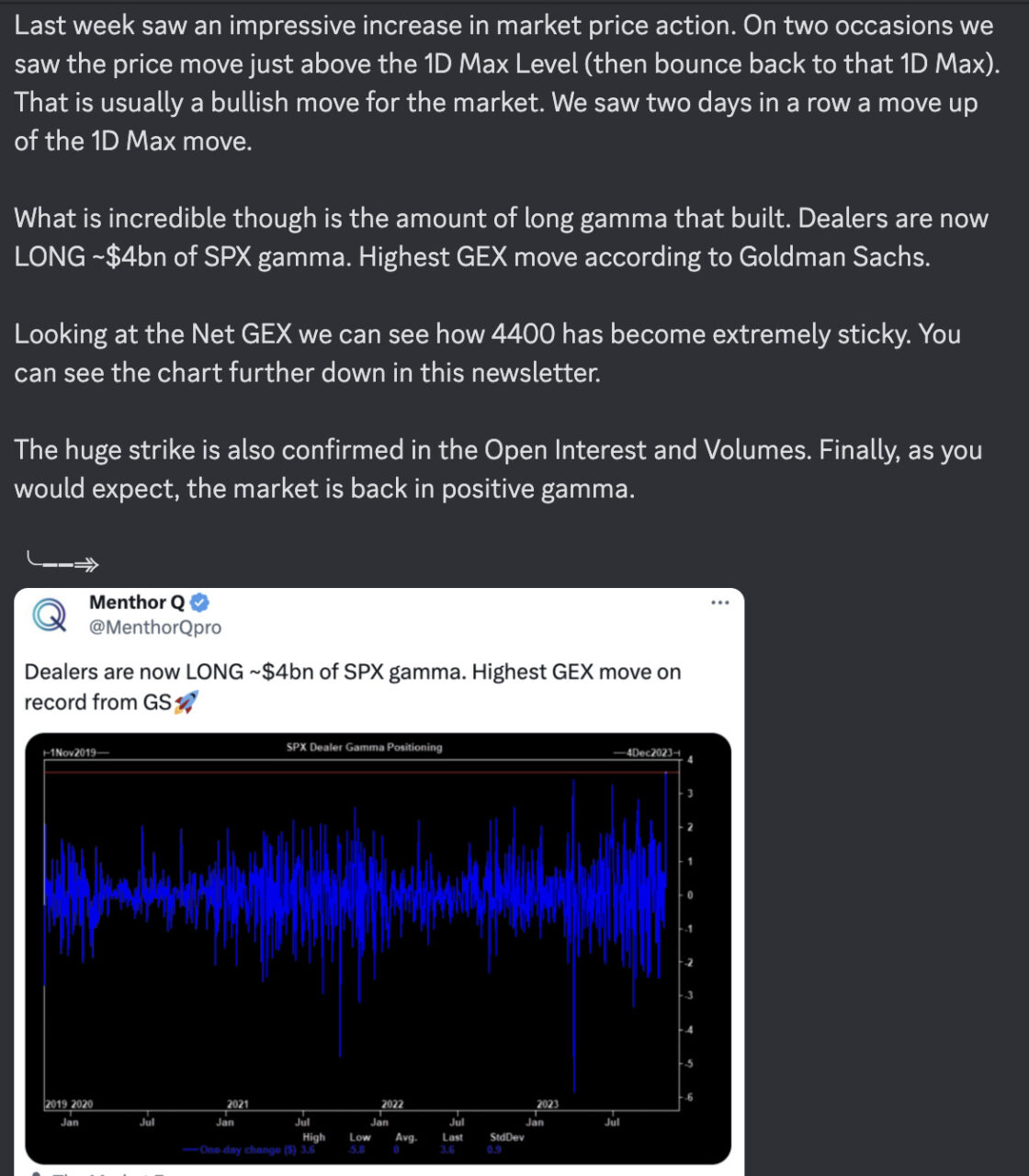
Menthor Q Data and Models
On top of the Daily Note you will have access to our Data and Models on three assets: SPX, QQQ and VIX.
If you are interested in receiving the same level of data on single Stocks, Indices and ETFs and soon Crypto and Futures you can try our Premium Membership for Free.
Now let’s look at each of the charts and table you will receive with our Daily Report.
Main Table
In the main table you will find a snapshot of the previous day data and will be able to quickly read market sentiment. This can help you prepare your trading plan for the day.
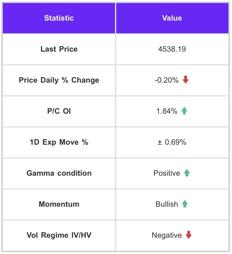
We see different fields:
- Last price and Price Daily % Change: This is a snapshot of the closing price and the daily % change.
- P/C OI (Put/Call Ratio Open Interest): The Put/Call Ratio Open Interest is a measure that compares the open interest of put options to the call options open interest. Open interest refers to the total number of outstanding contracts that have not been closed or delivered.
- 1D Exp Move %: Menthor Q’s proprietary indicator utilizes historical implied volatility to predict the price range movement, which is then presented as a percentage change from the previous day’s closing price.
- Gamma condition: this tells you if the market is in positive or negative gamma. Positive gamma comes with low price volatility. When the market is in negative gamma one expects higher price intraday volatility.
- Momentum: by looking at technical indicators coming from the price action we analyze if the momentum is Bullish, Bearish or Neutral for the underlying asset.
- Vol Regime IV/HV: the index describes the current volatility regime. There are two categories to describe this regime:
- Positive: in this scenario implied volatility is greater than historical volatility
- Negative: in this scenario implied volatility is lower than historical volatility
Main Chart
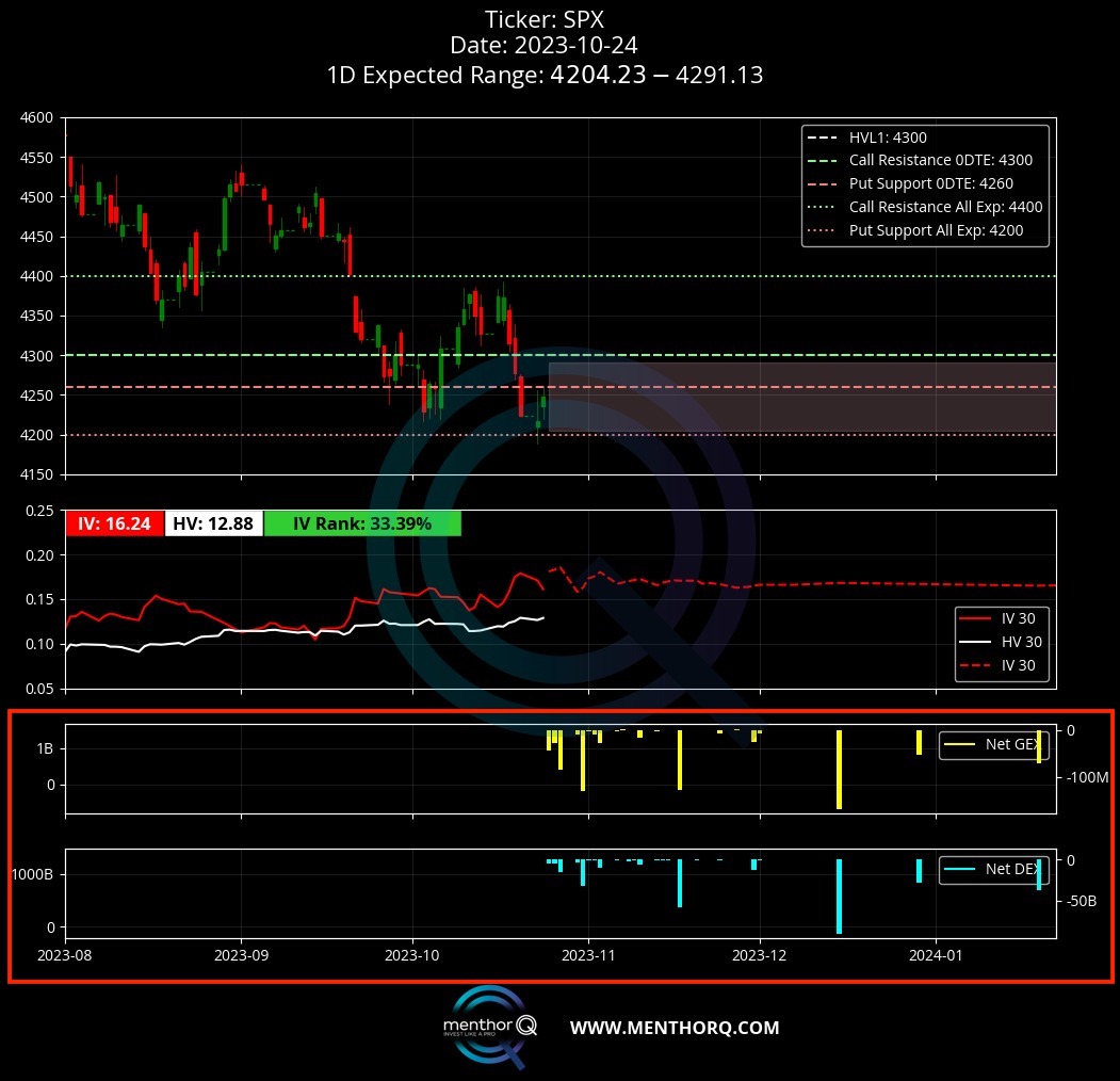
The main chart will provide a graphical representation of the key levels in a chart. Here you can find different sections.
Section 1. Spot Price and Key Levels
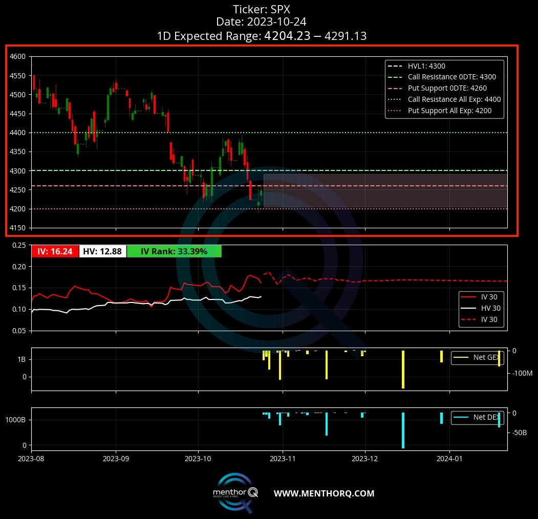
In this section you will see historical prices and key levels. We are plotting the following fields:
- Spot Price: this is the current price of the underlying. This is represented by the green and red candle sticks.
- Call Resistance All Exp: this is the price level with the most net gamma when it comes to calls. Generally this is the level with the most upward resistance. A shift upward of this level can be bullish for the market. It is represented by the green dotted line. We are looking at data from All Expirations in the option chain.
- Put Support All Exp: this the price level with most net gamma when it comes to puts. Generally this is the level with the most downward support. A shift downward of this level can be bearish for the market. It is represented by the red dotted line. We are looking at data from All Expirations in the option chain.
- High Vol Level (HVL): this is a key level. When the market is above this level we are in a positive gamma environment. Below it we move into a negative gamma environment. This level is usually found between the Call Resistance and the Put Support level. We expect realized volatility to move higher as spot price breaks below this level. It is represented by the white dotted line.
- Call Resistance 0DTE: this is the price level with the most net gamma when it comes to calls with an expiry of 24 hours or less.
- Put Support 0DTE: this is the price level with the most net gamma when it comes to puts with an expiry of 24 hours or less.
- 1D Expected Range: this is Menthor Q’s proprietary indicator and is set to forecast price range movement by looking at historical implied volatility. The range is expressed in Min and Max number or Low and High Expected Move for the day.
Section 2. Historical vs Implied Volatility
In this section you will be able to compare the spread between historical and implied volatility 30 days of the underlying asset. This can be used to build your options spread and trading strategy.
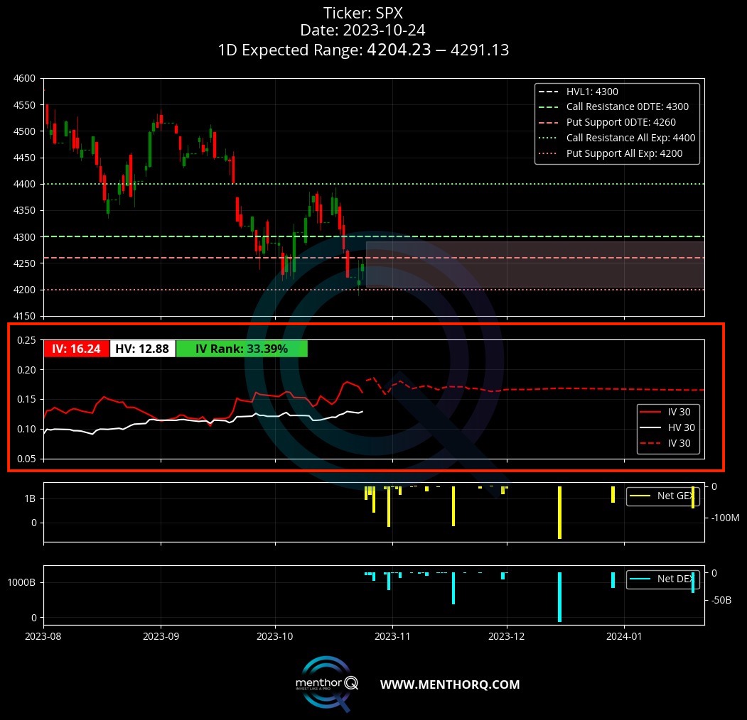
We can see Historical volatility and implied volatility and typical minimum and maximum movement of historical and implied volatility. On average, implied volatility is higher than historical volatility. This is because, due to uncertainty, implied volatility tends to be priced at a premium compared to historical volatility.
If we look at the minimum and maximum, implied volatility tends to be less volatile than historical volatility, especially when we look at the historical volatility of options near maturity. As we know for gamma and delta, the closer we get to expiration and ATM, the more sudden market movements are possible.
For this reason, the historical volatility of these options near maturity is very high. Therefore, if we compare the IV and HV term structures, we see that HV has more sudden movements than IV. When HV spikes, market price becomes volatile. Comparing HV and IV helps us have a better understanding of potential volatility breakouts.
On the chart you can also see the value of IV, HV and IV Rank.
Section 3. Net GEX and Net DEX
Let’s look first at what GEX and DEX can be used for:
- Net GEX is the net gamma exposure, which is calculated by subtracting put gamma from call gamma for the underlying. It is an important metric for evaluating the level of realized volatility in the market. A positive Net GEX is indicative of lower volatility. This is because if the market maker is long Net GEX, they are able to decrease realized volatility by delta hedging. The market maker would go short when the market surges and go long when it declines, thereby reducing volatility. However, if the Net GEX is negative, the opposite effect is observed. In such cases, the market maker shorts the market when it drops and goes long when it surges, which amplifies the market movements.
- Net DEX is the net delta exposure, which is computed by subtracting call delta from put delta, similar to the process of calculating net GEX. The primary purpose of calculating the net delta is to determine whether the market maker has a long or short delta position, which has implications for market liquidity and price movements. The market maker needs to go long or short on the underlying asset to be delta-neutral as they delta-hedge their positions. The following table summarizes this concept.
TradingView Integration
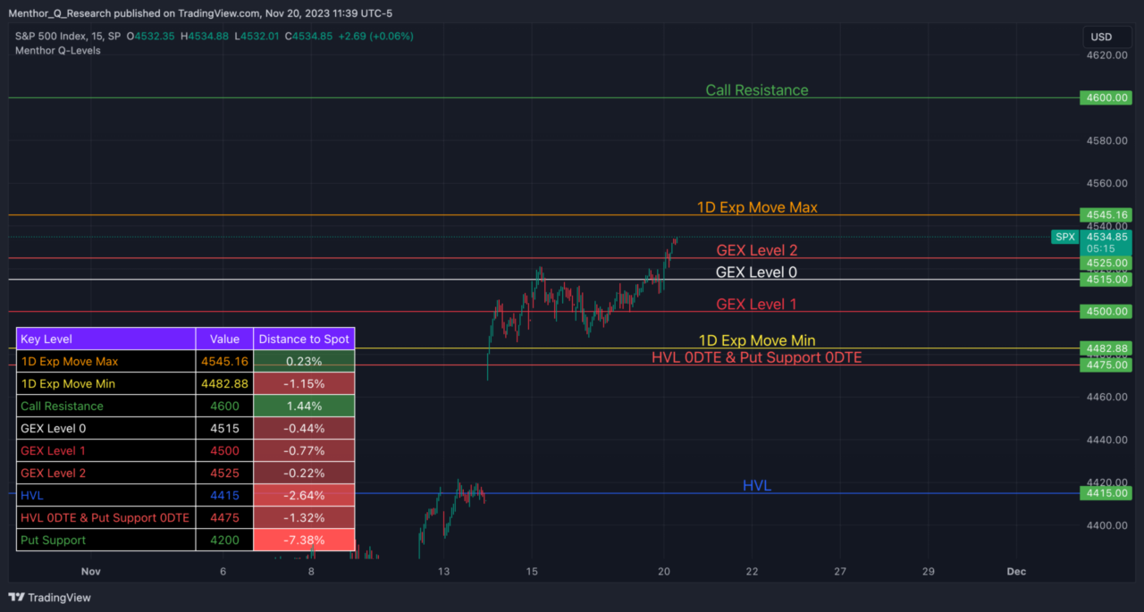
Our Key levels can now be integrated and set up into TradingView. To add Q-Levels to TradingView follow the steps to set up the indicator here:
Once the indicator is set up you can copy and paste this text into the indicator every morning to get the updated level into the most used charting platform in the world.
Primary and Secondary Levels
Here you will find the Primary Key Levels (Call Resistance, Put Support, HVL, 1D Exp Move, etc) as well as Secondary Levels. These are shown as GEX Level 0 to 10 and represent the Levels with the highest Net GEX and DEX that are within the 1D Exp Range.
For Example GEX Level 1 will be the level with the highest Net GEX and DEX within the 1D Exp Move Max and Min, GEX Level 3 will be the third level with the highest Net GEX and DEX within the 1D Exp Move Max and Min and so on.
Key Levels Table
The Key Levels Table will summarize the data coming from the option chain and provide key data points to help you build your trading plan for the day.
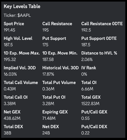
These are the fields that you will find in the table:
- Call Resistance: this is the price level with the most net gamma when it comes to calls. Generally this is the level with the most upward resistance. A shift upward of this level can be bullish for the market.
- Put Support: this is the price level with most net gamma when it comes to puts. Generally this is the level with the most downward support. A shift downward of this level can be bearish for the market.
- 0DTE Call Resistance: this is the price level with the most net gamma when it comes to calls with an expiry of 24 hours or less. These levels can be used to gamma scalp using 0DTE options.
- 0DTE Put Support: this is the price level with the most net gamma when it comes to puts with an expiry of 24 hours or less. These levels can be used to gamma scalp using 0DTE options.
- High Vol Level: this is a key level. When the market is above this level we are in a positive gamma environment. Below it we move into a negative gamma environment. This level is usually found between the Call Resistance and the Put Support level. We expect realized volatility to move higher as spot price breaks below this level.
- Distance to HVL %: Distance to HVL %: this tells us how far the spot is from the High Vol Level. This can be used in conjunction with the 1D Expected Move to see if based on volatility we are expected to move above or below the High Vol Level. A good tool for your risk management.
- 1D Exp Move Max: This is the maximum daily expected move for the day based on Menthor Q’s proprietary indicator 1D Exp Move %.
- 1D Exp Move Min: This is the minimum daily expected move for the day based on Menthor Q’s proprietary indicator 1D Exp Move %.
- Implied Volatility: Implied volatility is a measure of the market’s expectation of future volatility of an underlying asset, as reflected in the prices of options contracts. It is calculated using an options pricing model, such as the Black-Scholes model, which takes into account factors such as the strike price, time to expiration, and current market price of the underlying asset. A high implied volatility suggests that the market expects the underlying asset to experience large price movements in the future, while a low implied volatility indicates that the market expects the underlying asset to experience relatively stable price movements.
- Historical Volatility: Historical volatility is a measure of the actual volatility of an underlying asset over a specific period of time, calculated as the standard deviation of the daily price returns of the asset over that period. It provides a historical perspective on the level of volatility the underlying asset has experienced in the past. A high historical volatility suggests that the underlying asset has experienced large price movements in the past, while a low historical volatility indicates that the underlying asset has experienced relatively stable price movements. A spike in Historical Volatility could mean short term market stress is imminent.
- Total Open Interest: Open interest refers to the total number of outstanding contracts or positions that have not been closed or delivered on a particular future or options contract. Open interest represents the total number of contracts or positions that are still “open” or “unsettled” at the end of a trading day. For example, if there are 100 contracts of a certain commodity futures contract that have been bought but not yet sold, and 50 contracts that have been sold but not yet bought, then the open interest for that contract would be 150.
- Total Call Open Interest: this is the open interest for call options.
- Total Put Open Interest: this is the open interest for put options.
- Total Call Volume: Total volumes refer to the total number contracts traded in a particular market the day before. Volumes are a key metric used to measure the level of activity and liquidity in a market. High trading volumes are generally associated with high liquidity and indicate that there is a lot of interest and activity in a particular security or market. Low trading volumes, on the other hand, can indicate a lack of interest or uncertainty among investors. Total Call volumes refer to the total volumes of calls traded the day before.
- Total Put Volume: This indicates the total put volumes traded the day before.
- Gamma Expirations: This is the total notional of gamma expiring on a specific date. Big expirations can lead to technical movements in the market as participant re-hedge and re-position.
- Total GEX: This is the total volume of gamma exposure (GEX) per strike.
- Net GEX: This is calculated by taking gamma per calls minus gamma per puts. These could become sticky levels during the day. Strikes with the highest net gamma can act like magnets.
- P/C GEX: This is the ratio of the total GEX per call vis a vis total GEX per puts.
- Total DEX: This is the total volume of delta exposure (DEX) per strike.
- Net DEX: Net DEX is calculated by taking delta per calls minus delta per puts.
- P/C DEX: This is the ratio of the total DEX per call vis a vis total DEX per puts.
- IV Rank: IV Rank, is used to compare the current implied volatility to its historical implied volatility over a specific period of time. It is a way to assess whether the current implied volatility is high or low compared to its historical levels. It is expressed as a percentage and is calculated by taking the current implied volatility and comparing it to the range of implied volatility values that the option has traded at in the past. The range is typically defined as the highest and lowest implied volatility levels over a specific period of time, such as the past year. For example, if IV Rank is 100%, this means the IV is at its highest level over the past 1-year. An IV rank of 80% means that the current implied volatility (IV) of an asset is higher than 80% of its historical IV readings over a specified period of time, and lower than only 20% of them.
- IV Percentile: IV percentile, compares the current implied volatility of an option to its historical implied volatility over a specific period of time. It expresses the current implied volatility level as a percentage of its historical implied volatility distribution, rather than as a ranking within that distribution. It is calculated by first creating a distribution of implied volatility levels for the option over a specific period of time. This distribution is then used to determine where the current implied volatility level falls within that distribution. While IV rank compares present IV to both high and low volatility levels over the past 252 days; IV percentile tells us the percentage of days over the last year when IV was lower than its present level.
Net GEX by Strike Price
Here you can see the Net GEX by Strike Price. We analyze the Option Chain and look at key levels with higher levels of positive and negative Net GEX. These levels are catalysts for market activity around these key price levels.
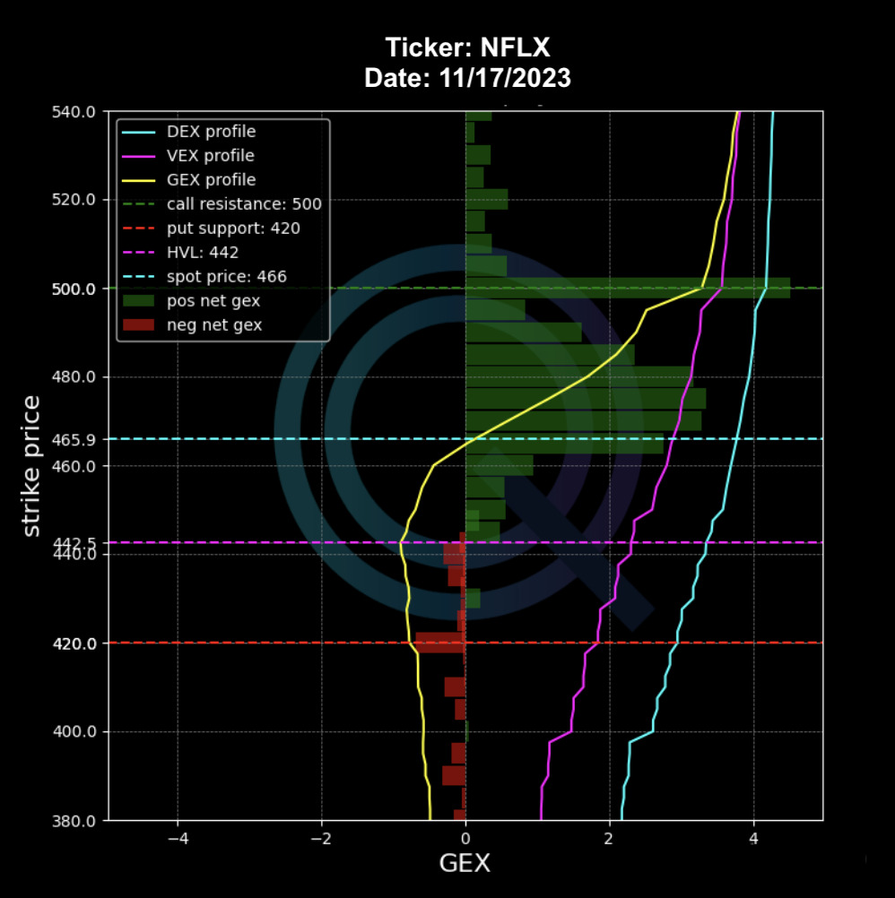
- Green Bars represent positive Net GEX
- Red Bars represent negative Net GEX
In the chart you can also find profiles for the Greeks. More specifically the chart outlines the cumulative Gamma Profile (yellow), the Delta Profile (blue) and the Vanna Profile (purple). These profiles provide the total exposure of these Greeks based on the strike price. This is helpful because we can visually see what strike prices can have more selling on buying pressure based on the Greeks.
The GEX profile is important because as we move up or down the GEX profile we move at, below and above the High Vol Level. This is the “flip level” between a positive or negative environment.
Why is this Chart important?
Like we explained above, the Net GEX is the gamma exposure. While in the previous section/chart we calculate it for a specific date, in this case we calculate the Net GEX by strike price. This gives traders the strike prices that have more potential of becoming magnets throughout the day.
Why we have it?
We can leverage this chart to see what strikes are more likely to be hit by the spot price.
Why should a trader use it?
The highest bars are the ones that have higher/lower negative/positive GEX. These strikes can act like magnets, support/resistance levels or breakout points. These strikes can also be used to place strikes if you are implementing an options spread strategy.
Note: You can use this chart together to get confirmation if we are or are moving towards a level of high realized volatility. Remember positive gamma is generally an environment when we expect low realized volatility. The opposite happens in a negative gamma environment.
Net GEX 0DTE and Multi Expirations
What are 0DTE Options?
0DTE options stands for “zero days to expiration options”. These are options contracts that expire on the same day they are opened, meaning they have no remaining time to expiration. This also means that the effect of Theta is very high. We have a few article describing the importance of 0DTE:
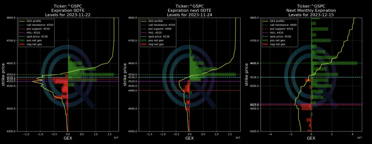
In this section you will find three different charts. These are all Net GEX charts like described above. The only difference is that we compare the Net GEX for different expiries. You can see the different charts by scrolling to the right.
The First Chart is the 0DTE. This allows you to see out levels for 0DTE as well as the gamma profile and how that changes by strikes. The green and red bars represent positive Net GEX and negative Net GEX respectively. The next two charts in this section are only different when it comes to expiry. The first one is the 1D or weekly and the second one is a monthly expiry.
Open Interest & Volumes
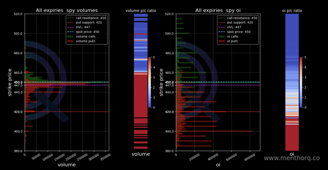
This next section features two charts. On the left hand side we have the volumes by strike price. As you scroll to the right you can find the Open Interest by strike.
Volumes Chart
We have call volumes in green and put volumes in red. Our levels are added in the chart. High level of volumes are generally a sign of higher liquidity. We want to see how the volumes move. Note that this chart alone won’t help, it is important to have market context as well as using other charts as confirmation of your view.
On the side you can see the heatmap of the Volume put call ratio. If the heatmap is blue there is more volume towards calls while red indicates more volume towards puts.
Open Interest Chart
In this chart you will find open interest by call and put for a specific strike. Calls are in green and Puts in red. Again, like in the case of volumes, open interest should not be used alone.
This indicator should be used with our walls as well as the term structure. For example an increase in put oi is not necessarily bearish if a lot of put spreads are being added in the market. Understanding the term structure and the skew and give us confirmation whether the put oi is actually bearish for the market. Also check the IV OI put/call ratio for confirmation.
On the side you can see the heatmap of the Open Interest put call ratio. If the heatmap is blue there is more OI towards calls while red indicates more OI towards puts.
Option Matrix
The Option Matrix is a powerful tool that summarizes a lot of data including 0DTE data. Each of these columns can give us specific information.The matrix represents the entire data/positioning for the month for a specific asset.
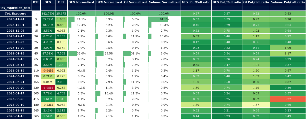
If we start from the left column this is what we would find:
- Expiration date: The first row represents the entire exposure for the month as of the date of issuance of the Option Matrix.
- DTE: this is the time to expiry. For example if you take 1, that would represent the 0DTE row or 1 day to expiration.
- GEX & DEX: those are your national GEX and DEX, similar to what you can find on the main screen.
Further on the right we can see additional fields:
- GEX and DEX Normalized: what we are doing here is simply taking the total amounts of GEX and DEX for the month and dividing it by the GEX & DEX of the specific date. This allows us to see how much GEX & DEX there is in a specific expiration date.
- OI Normalized: we take the total OI for the month and divide by the OI of the specific expiry. Obviously dates with big OI are of interest for traders.
- Volume Normalized: same exercise of normalization we have done before. We take the entire volumes for the month (as of the date of issuance of the Option Matrix) and divide by the volume on the specific date. We want to see the dates with the highest volumes. Again those become of interest for traders.
- GEX and DEX Put Call Ratio: these two columns are telling us if there is more GEX and DEX on puts or calls. This can be integrated with your GEX & DEX indicators to confirm if volatility is becoming stronger or weaker.
- OI Put / Call: again, where is the most open interest? On puts or calls? A bearish market would see a spike of OI towards puts. This helps us track it.
- Volume Put / Call: here we look at how the volumes are building between calls and puts. We like to use this indicator for confirmation of what is happening with the Open Interest.
- In the next columns you will find our gamma levels. Again this is interesting because we create the levels throughout the entire month for a specific date. This can give you a good sense of how the market is positioned. You can access High Vol Level, Gamma OI Level, Call Resistance, Put Support for each expiry.
- 1D Expected Move: finally we have our proprietary indicator the 1D Expected Move. This gives us the range of movement for the next expiration.
Top 10 Positive and Negative Net GEX and DEX
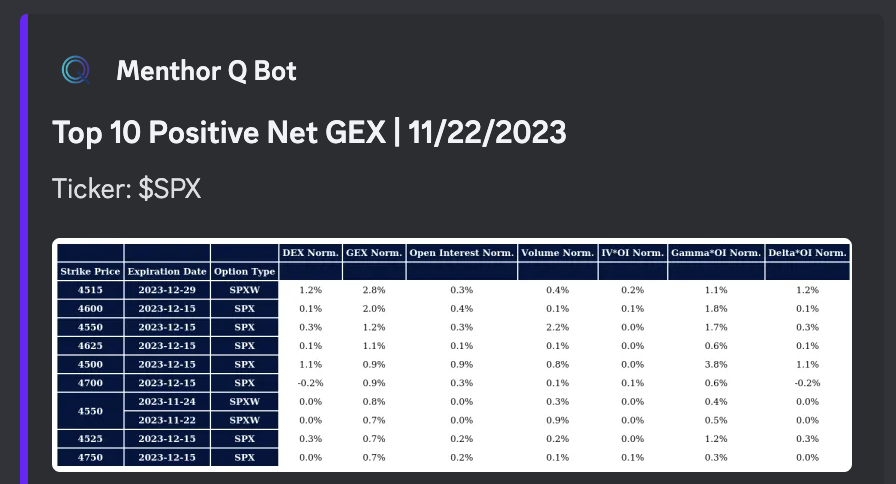
This section analyzes the strike prices with most positive & negative GEX and DEX.
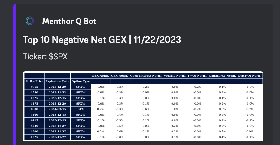
How to read this table?
You can find the following fields:
- Strike Price: this is the strike price for the option
- Expiration Date: this is when the option expires
- Option Type: it looks at Daily (D) Weekly (W) and Monthly (M) options
- DEX Norm: here we take the DEX exposures and normalize it by the strike and expiration
- GEX Norm: here we take the GEX exposures and normalize it by the strike and expiration
- Open Interest Norm: this is the open interest normalized
- Volume Norm: this is the volume normalized
- IV OI Norm: this is the implied volatility open interest normalized
- Gamma and Delta OI Norm: this takes the greeks’ open interest and normalized it
What does it mean to normalize?
It divides the total value of an index for the month by the specific expiry date. For example, we take the total OI for the month and divide by the OI of the specific expiry. Normalizing allows you to see which dates within the month have the highest OI.
Why we have it?
These tables can be used to see which strikes are most sticky. You can use this for confirmation of the gamma levels and Net GEX. Also these strikes can be further strikes that you may want to use when placing strikes for your spread trading. Wider or narrower strikes can increase or lower your spread’s risk.
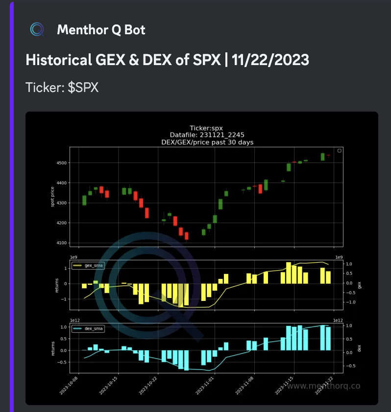
Historical GEX and DEX
This is an historical chart of the underlying asset and its GEX and DEX levels overtime. The chart is broken down in 3 sections:
First Pane:
- Historical Spot Price (candles)
- Simple Moving Average (SMA) 20 days, 50 days and 200 days
Second Pane:
- Historical GEX with SMA on GEX
Third Pane:
- Historical DEX with SMA on DEX
Why we have it: this allows you to see how the spot price has moved historically against simple moving averages, GEX and DEX.
Bid Ask Spread
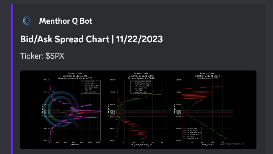
In this section we look at the bid ask spread per strike to see whether a particular strike is very liquid or not. We wrote another article on the Bid Ask Spread in our Resources Section.
What is the Bid/Ask Spread?
The bid-ask spread is the difference between the highest price a buyer is willing to pay for an asset (the bid price) and the lowest price a seller is willing to accept for the same asset (the ask price) at a given time.
The bid price is typically lower than the ask price, and the difference between the two prices represents the spread. The spread is a reflection of the supply and demand dynamics in the market and is influenced by various factors, such as the liquidity of the asset, market volatility, and trading volume.
The bid-ask spread is an important concept in finance and investment, as it affects the cost of buying and selling assets. The wider the spread, the more expensive it is to trade the asset, as traders have to pay a higher price to buy and receive a lower price when selling. Conversely, a narrower spread makes it cheaper to trade the asset.
The bid-ask spread is used as a measure of market efficiency, with lower spreads indicating a more liquid and efficient market. Traders and investors monitor the bid-ask spread closely to make informed trading decisions and to assess the overall health of the market.
When it comes to options with different strike prices, the bid/ask spread can vary based on several factors:
- Option liquidity: Highly liquid options tend to have smaller bid/ask spreads because there are more buyers and sellers actively trading those options. Less liquid options, especially those with wider strike price intervals, may have larger bid/ask spreads.
- Time to expiration: Options with shorter time to expiration generally have smaller bid/ask spreads. As expiration approaches, the options become less valuable, reducing the spread.
- Intrinsic Value: In-the-money options (options with strike prices favorable to the current market price) tend to have smaller bid/ask spreads compared to at-the-money or out-of-the-money options. This is because in-the-money options have intrinsic value, making them more attractive to traders.
- Volatility: Higher volatility in the underlying asset can increase the bid/ask spread for options. When the market is more uncertain, traders may demand a higher premium, leading to a wider spread.
- Option volume: Options contracts with higher trading volumes often have tighter bid/ask spreads due to increased liquidity and market participation.
It’s important to note that bid/ask spreads can vary greatly depending on the specific option, market conditions, and the brokerage platform used for trading. Traders should always consider the bid/ask spread when entering and exiting option positions, as it directly impacts their potential profitability.
How to read the chart?
We like to track the bid ask spread for the following reasons:
- A higher bid ask spread tells you that a particular strike is not very liquid
- When the bid ask is narrow it shows higher liquidity of a particular strike
- A strike with low liquidity can also indicate lower volume
- We look at the bid ask for puts and calls, and we use this indicator in conjunction with calls and puts open interest and volumes
Term Structure
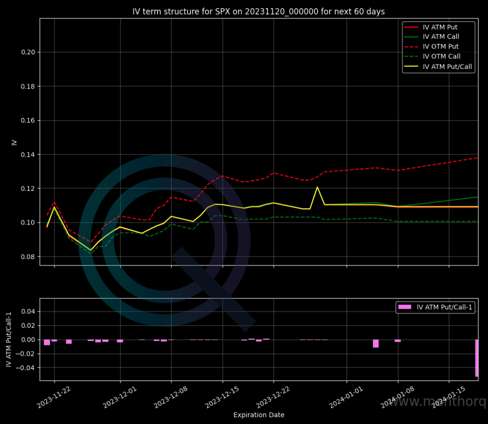
The term structure of volatility is a graph that represents the relationship between the maturity of an option and its implied volatility. In other words, it shows how expected volatility for a stock or index varies at different time horizons. This relationship is important because it helps to understand how expected volatility changes over time and how it impacts the price of options.
How to think about the Term Structure?
When we look at the Term Structure, it’s important to distinguish between its different parts. This is important because often when investors talk about volatility, they refer to volatility in different parts of the curve.
The short end of the curve is known as the front end. It’s sometimes also called the short end. In this part of the curve, you can find all the short-term maturities. When we move along the curve, we then arrive at the back end, also known as the long end of the curve. Here we find the longer maturities.
How to read the Chart?
What can you see in the chart:
- ATM IV for Puts and Calls
ATM options are those with a strike price that is closest to the current price of the market. These are the options that are most sensitive to changes in the level of volatility in the market. An increase or decrease in this part of the term structure helps understand the perceived level of risk in the market.
- OTM IV for Puts and Calls vs Maturity
OTM options are those that have a strike price far from the current market price of the underlying asset, and therefore they have a lower probability of being exercised or expiring in the money. It is important to understand market positioning but also how marker makers will have to re-hedge their positioning as the delta of those OTM options start changing. What we are trying to do here is to understand how the volatility has changed for the different Moneyness and throughout the entire curve.
For example, in events where we see a drop in GEX, we would expect the short part of the curve to move up; generally bearish for the SPX. As we create the backtesting tool, we will use the term structure vis a vis with DEX, GEX, VEX to create buy and sell signals. Remember the vol curve is mean reverting, so as it moves back to the mean, that creates fuel for the stock market.
SKEW / Risk Reversal
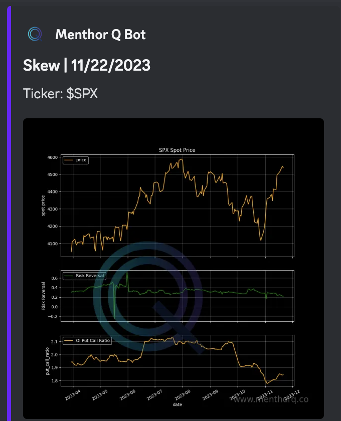
In this chart from better visualization, we compare the spot price with Put/Call OI ratio and the Risk Reversal.
What is the Risk Reversal?
It’s a form of Skew to describe the difference in implied volatility between out-of-the-money (OTM) call options (25 Delta) and out-of-the-money put options, with the same expiration date.
What are we looking for?
The risk reversal skew is said to be “skewed” when the implied volatility of OTM put options is higher than that of OTM call options. Conversely, the skew is “normal” when the implied volatility of OTM call options is higher than that of OTM put options.
A positive risk reversal skew suggests that market participants are more concerned about potential upside risks, while a negative risk reversal skew suggests that market participants are more concerned about potential downside risks.
Risk Reversal and Put/Call OI Ratio
As mentioned above looking at OI alone can be misleading particularly if there is a lot of spread action in the market. Therefore we look for other indications of what is happening in the market. The risk reversal is an interesting tool that helps gauge sentiment and positioning.
How to think about the relationship between Skew and Term Structure
We note that as the market drops, the front of the term structure moves up. In these cases, the skew rises on the left side. This happens because we are seeing an increase in volatility on the put side. This causes the skew and the premium paid on these puts to rise.
What are possible reasons for the relationship between Skew and Term Structure?
- The first happens during events, such as bankruptcies or market crashes. These cause both to move in the same direction.
- Then there’s implied volatility, which becomes stickier the closer the underlying price gets to the lower strikes.
- And finally, implied correlation. The implied correlation of an index is a measure of the correlation between the members of a market index, for example, the correlation between Tesla and Apple in the SPX index. In other words, implied correlation represents the degree of correlation that is implicit in option prices on the market. This measure is based on options theory and mathematical analysis of correlations.Implied correlation is calculated using an options pricing model that takes into account volatility, underlying stock prices, and option expiration dates. A high level of implied correlation indicates that index members are strongly correlated with each other, while a low level indicates weak or no correlation. Implied correlation can be used as an indicator of market expectations regarding risk diversification in indices. For example, during periods of economic uncertainty, implied correlation tends to increase because investors expect index companies to move similarly. This can have important implications for investors, as it can affect the diversification of their portfolio and risk management. During periods of stress, the implied correlations between all index members increase, and this is reflected in the term structure and skew rising in the same way.
Key Levels on QQQ and VIX
In the report you will also find the same data for other assets: QQQ and VIX. The QQQ gives us a good understanding of positioning for the Technology Sector while the VIX allows us to understand the level of Fear and Greed in the Market. VIX is often used as a hedging tool by investors.
