How to use Gamma and Liquidity Levels

With our Free Daily Report and our Premium Membership you can access our Gamma and Liquidity Levels. Let’s see how the models work and how they work.
Liquidity Levels Main Screen
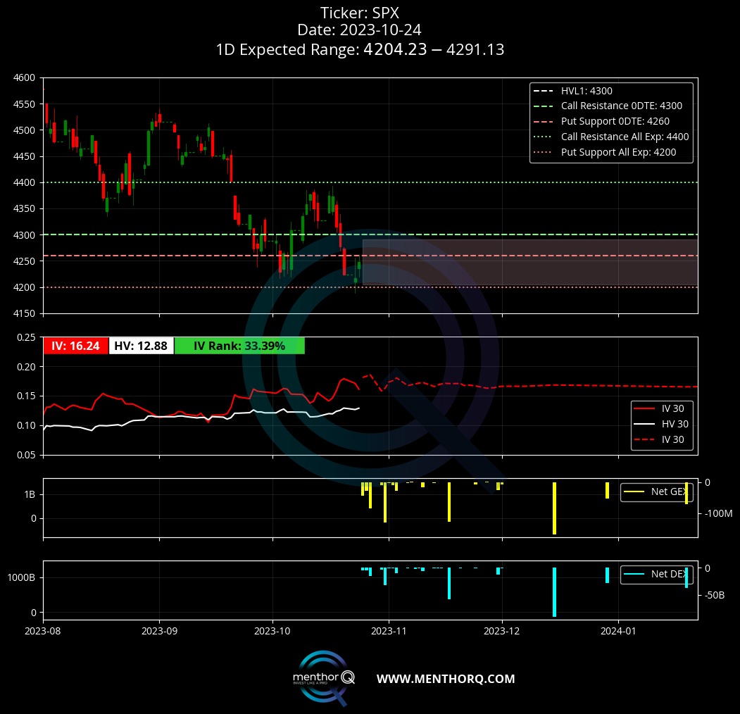
Here is the main screen of the Q-Models. The model is designed to track market liquidity levels in the short term looking at the option market. When we talk about the market, we are looking at the most liquid market, the S&P 500 index. The model will also be available for other assets and single stocks and ETFs. It is updated daily at the market close. The model automatically calculates the levels every evening by taking the option chain of a particular index or stock.
This model is important and useful because it helps us understand how investors are positioned in the options market. This is an important exercise because positioning becomes a key part of market movements.
From a liquidity perspective, it helps us because it follows the activity of market makers. As you now know our goal is to follow the market maker’s delta hedging activity. This helps us know if we are in a market where there is positive or negative liquidity based on that activity.
Now let’s take a closer look at the levels and indicators.
The first thing we look at is the levels. Levels are the most important points of interest. In this case, the model calculates where there is the most gamma at each price level or strike price. Where there is more gamma, it means that strike can become:
- A point of interest, the underlying price can reach that level during the day
- Or it can be an important level to use for placing strikes if we are trying to create a spread strategy. The levels can act as support/resistance levels

The Levels
Let’s start with the Put Support Level that you see in red. We are interested in this for the following reasons:
- This is the level where there is the most support in the market based on the positioning of participants in put options
- At this level, we see the highest Net GEX on the puts
- In general, when the market reaches this level, it tends to bounce back up.
- If the market goes below this level, we can usually expect market declines of more than one standard deviation
The next level is the Call Resistance Level. We are interested in this for the following reasons:
- This is the level where there is the most resistance in the market based on the positioning of participants in call options
- At this level, we see the highest GEX on calls
- In general, when the market reaches this level, it tends to touch resistance and bounce down
- If the market goes above this level, we can usually expect a strongly bullish market
We can use Call Resistance and Put Support as market sentiment indicators. If we see a shift in the levels over time, this represents market expectations. For example, if the Call Resistance Level moves upwards, the bullish sentiment is increasing. If the Put Wall moves downwards, it means that bearish sentiment is growing.
This brings us to the next level: the High Vol Level. This level should be thought of as the level that takes us into different volatility regimes. It is one of the most important levels.
1D Expected Move Indicator
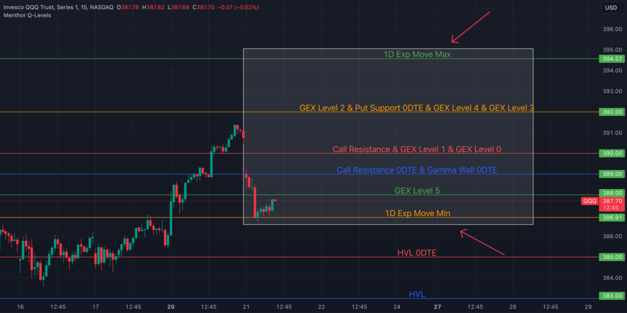
We introduced you to our 1D Expected Move Indicator. What this does is take forward implied volatility and help us project possible future movements.
The chart has a cone in front of the price. That is what the model expects the move to look like throughout the day. In the chart you can see the price expectation on Tesla for the next day.
At this point, you already have four pieces of data that can help your options spread strategy.

Option Matrix
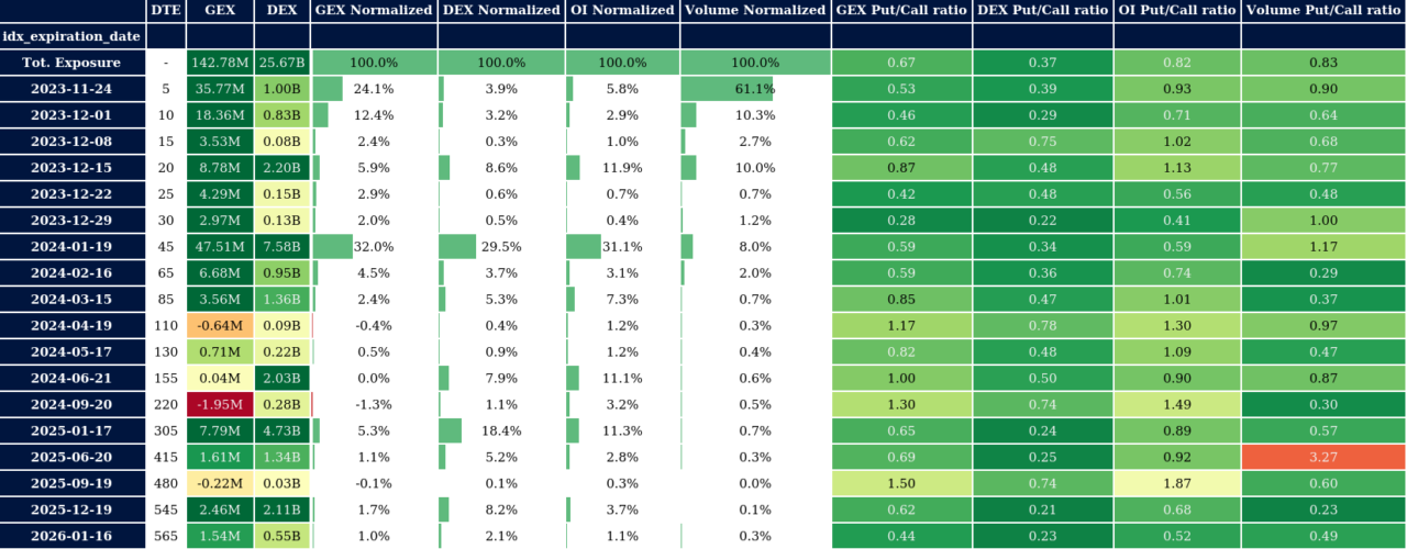
As part of our daily report, we offer a tool called the Option Matrix, which we are continuously refining to make it more user-friendly and actionable. Essentially, this tool presents all option data for various expiries throughout the month.
It serves multiple purposes, and the first thing we do each morning is to review the Matrix to determine the levels for the 0DTE. We have included a screenshot of the 0DTE line below (you can see expiry in first two columns).
For each expiry, the tool provides greek exposures, open interest, and volumes. The data we’re interested in is highlighted in orange. By analyzing the current positioning (end-of-day data), this feature allows us to anticipate the levels for options that are about to expire (0DTE).

What are the Greeks projecting?
As previously mentioned when discussing the Matrix, we can leverage option positioning data to project future trends. While the Matrix provides a more in-depth analysis of various maturities, the main screen enables us to visualize this data in relation to the current price of the SPX.
You can use this chart in any way that suits your needs, but we find it particularly useful in assessing sentiment. By examining the Cumulative GEX/DEX, we can determine whether the market outlook is more bullish or bearish based on gamma and delta exposures.
It’s important to note that GEX is particularly relevant when trading volatility. Positive GEX is indicative of negative volatility, while negative GEX reflects positive volatility. Therefore, monitoring GEX provides a clear indication of the volatility regime, which we will discuss further in this note.

