Momentum Models

Market momentum refers to the rate of acceleration of a market’s price or volume. Momentum indicates the strength of price trends over time and can often predict whether a market move is likely to continue in the same direction.
In technical analysis, momentum is typically measured using various indicators and models to assess whether a trend is strong or weak and to help forecast potential points of reversal or continuation within a market. When we look at Momentum we need to consider:
- Trend. Momentum is based on identifying trends in asset prices. We can use technical indicators such as moving averages, Relative Strength Index (RSI), and volume to determine the strength and confirmation of a trend.
- Volatility. Momentum strategies thrive in markets with high volatility because it provides more opportunities for the trends to develop and for traders to capitalize on them.
- Volume. High trading volume often accompanies strong momentum, confirming the strength of a trend.
- Sentiment. Market sentiment and positioning can drive momentum.
While following the trend of an individual stock is important, it’s even more relevant to understand the trend of the market, as broader market movements can significantly influence individual securities. This is why we have developed the Menthor Q Momentum Models that can be found within the Premium Membership. Let’s look at the different models in more details.
Menthor Q Market Breadth
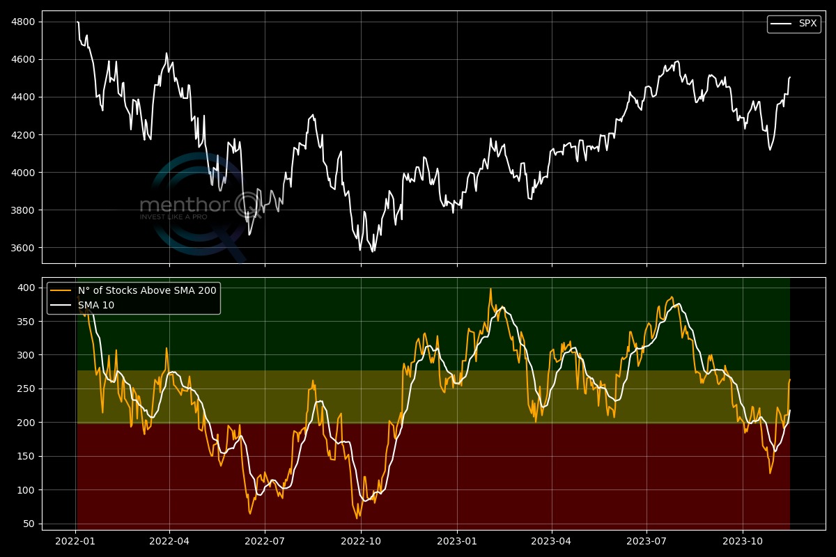
The Menthor Q Market Breadth tracks the percentage of S&P 500 stocks trading above their 200-day moving averages.
Market breadth, using the 200-day moving average, is a signal of the overall health and direction of the market by assessing how many stocks are participating in the trend. By counting the number of stocks above their own 200-day moving average, we can determine if a market move is broadly supported.
- A strong market trend will typically see a large proportion of stocks above this key moving average, indicating widespread bullish sentiment.
- If fewer stocks maintain levels above their 200-day moving average, it may suggest underlying weakness in the market, even if the broader indices seem to be performing well. This divergence can often provide early warning signs of potential trend reversals or market corrections.
Within the indicator at the bottom you can see how many of the S&P 500 Stocks are above the 200-day moving average. This indicator can help investors understand the overall health and potential direction of the market by showing whether movements are broad-based or led by only a few stocks.
Menthor Q Trend Bias
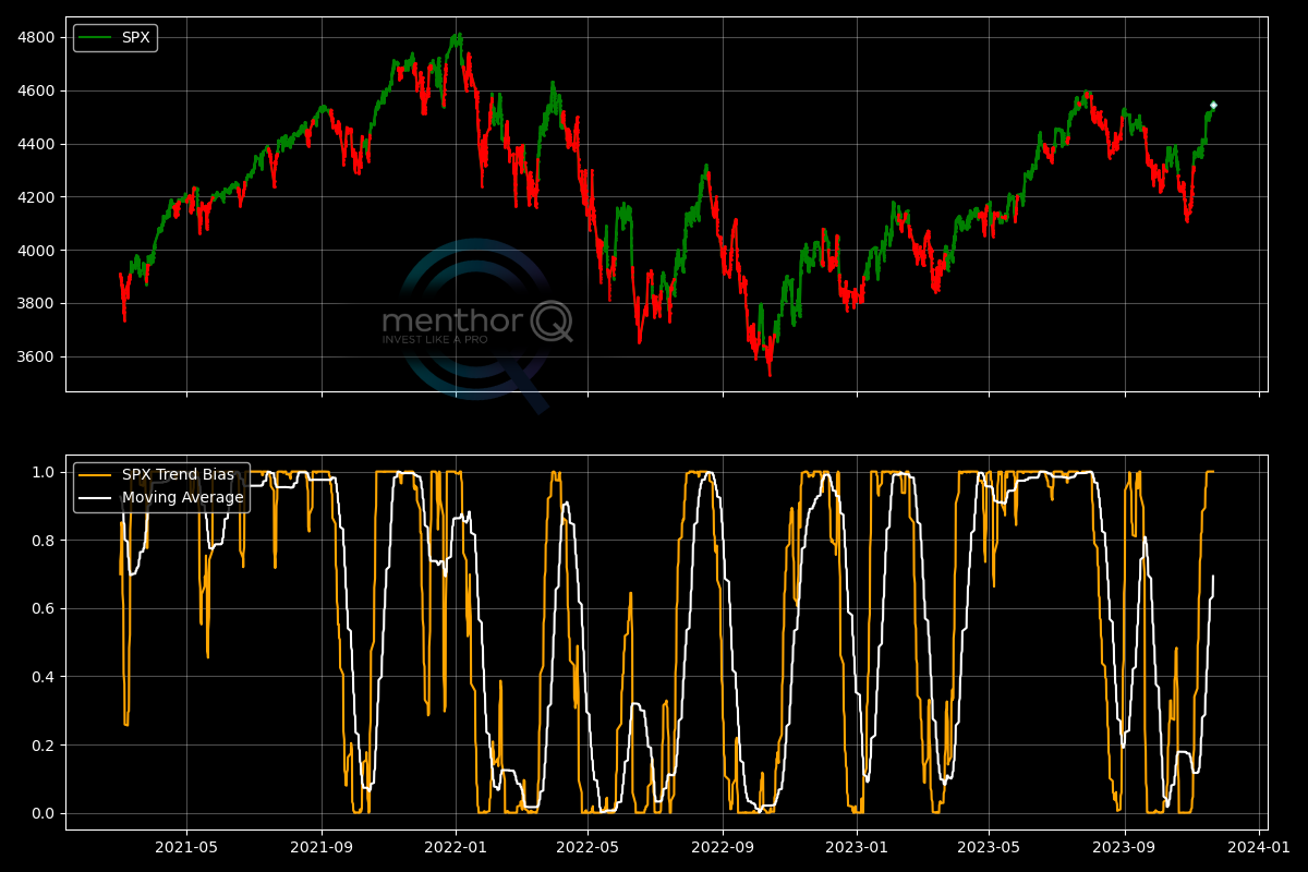
The Trend Bias Indicator uses a subset of all possible moving averages and tests how many cases exhibit a bullish cross (fast MA > slow MA).
We then create a trend model using this data, and the output visible in the lower part of the graph is an oscillator that indicates the most likely trend. In the upper part of the graph, you can observe past occurrences: a green line candles a probable bullish trend, while a red line suggests a more likely bearish trend.
Menthor Q Super Trend Indicator
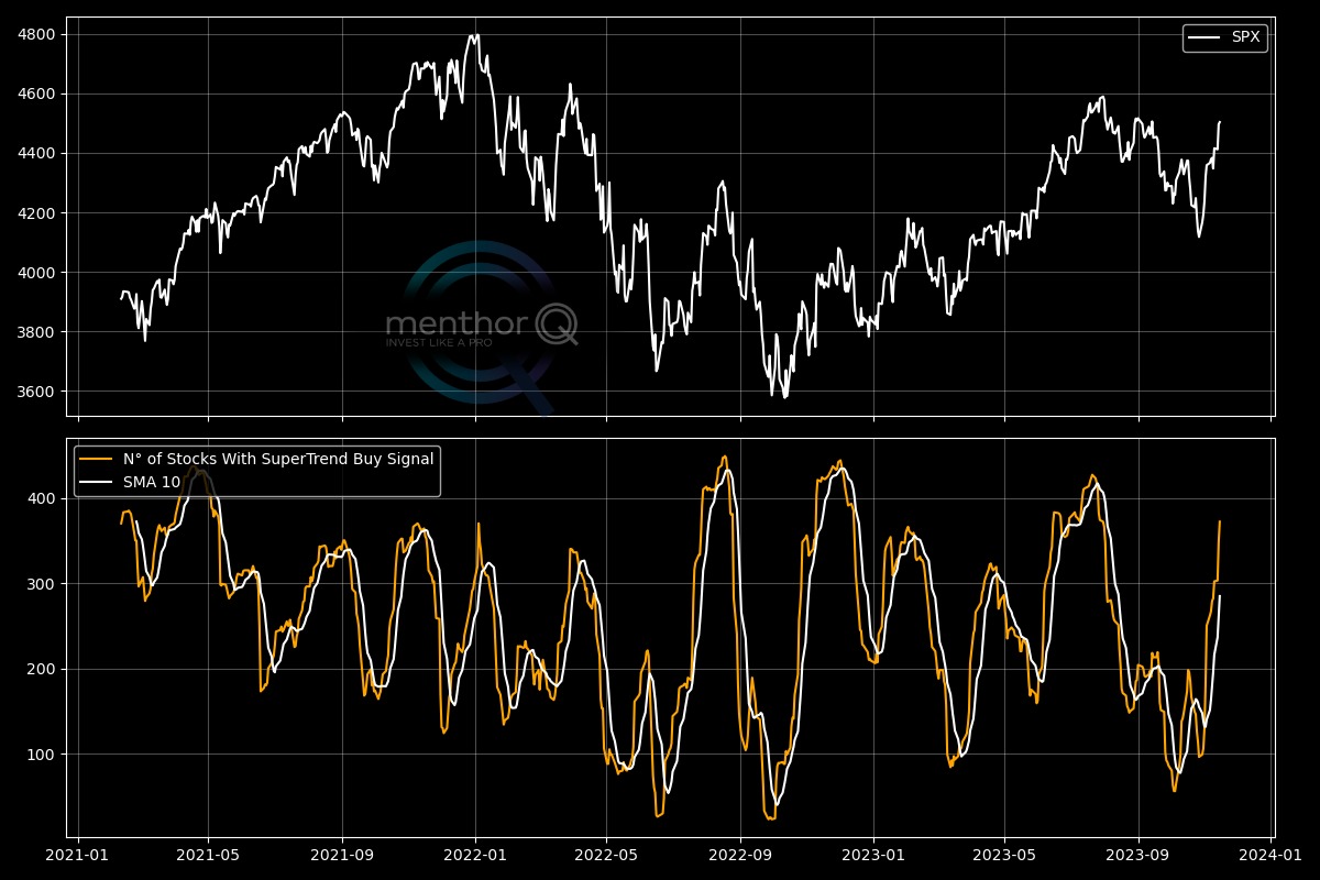
The Supertrend indicator is a trend-following overlay on a trading chart, similar to moving averages. It is plotted on price and its placement helps in determining current trend direction. It uses the average true range (ATR), a measure of volatility, along with a multiplier to determine the trend.
The Super Trend Indicator tracks the number of stocks within the S&P 500 index that are in a Super Trend Buy Signal mode.
Menthor Q RSI and Bollinger Bands Indicator
RSI (Relative Strength Index) and Bollinger Bands are both technical analysis tools used by traders, but they belong to different categories of indicators.
The RSI is a momentum oscillator that measures the speed and change of price movements. It oscillates between zero and 100 and is typically used to identify overbought or oversold conditions in a market. An asset is generally considered overbought when the RSI is above 70 and oversold when it’s below 30. The RSI is a momentum indicator.
Bollinger Bands are a type of price envelope developed by John Bollinger and are used to gauge the volatility and price levels of an asset over time. They consist of a middle band being a moving average, with an upper and lower band calculated based on the standard deviation of the price from the moving average. Bollinger Bands expand during periods of increased volatility and contract during periods of reduced volatility. This tool falls under the category of volatility indicators.
While both are used to measure different aspects of the market and can complement each other, RSI focuses on the momentum and the strength of the price movement, whereas Bollinger Bands focus on the range of the price movement and volatility.
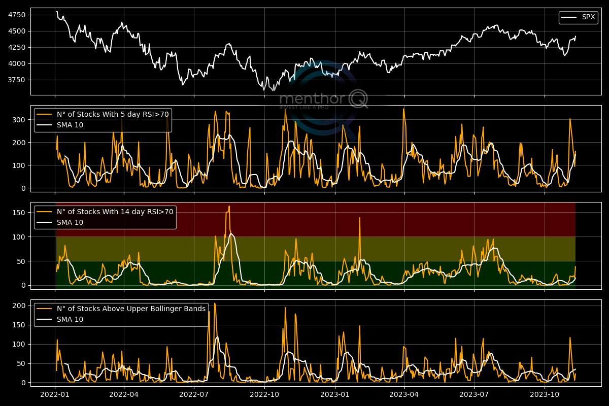
The Menthor Q RSI and Bollinger Bands Indicator comes in a 4 chart format:
- The first pane is the underlying asset. In our case the S&P 500 Index.
- The second pane shows the number of stocks within the index that have an RSI 5D greater than 70 and are in overbought condition.
- The third pane shows the number of stocks within the index that have an RSI 14D greater than 70 and are in overbought condition.
- The fourth pane then shows the number of stocks within the index that have a price above their upper Bollinger Band.
The fact that both short-term and medium-term RSI indicators are high could indicate strong bullish momentum in the price of the security. Both the 5-day and 14-day RSI readings above 70 suggest that the security may be overbought. This means that the price has risen relatively quickly, and there might be a higher probability of a pullback or correction.
The price trading above the Upper Bollinger Band indicates that the price is at a relatively high level compared to its recent average. When the price exceeds the upper band, it could mean that the security is trading at a level beyond its usual range, which could be a sign of high volatility.
The indicator then provides a reading of the market showing the overall momentum and volatility.
Menthor Q Moving Averages Indicator
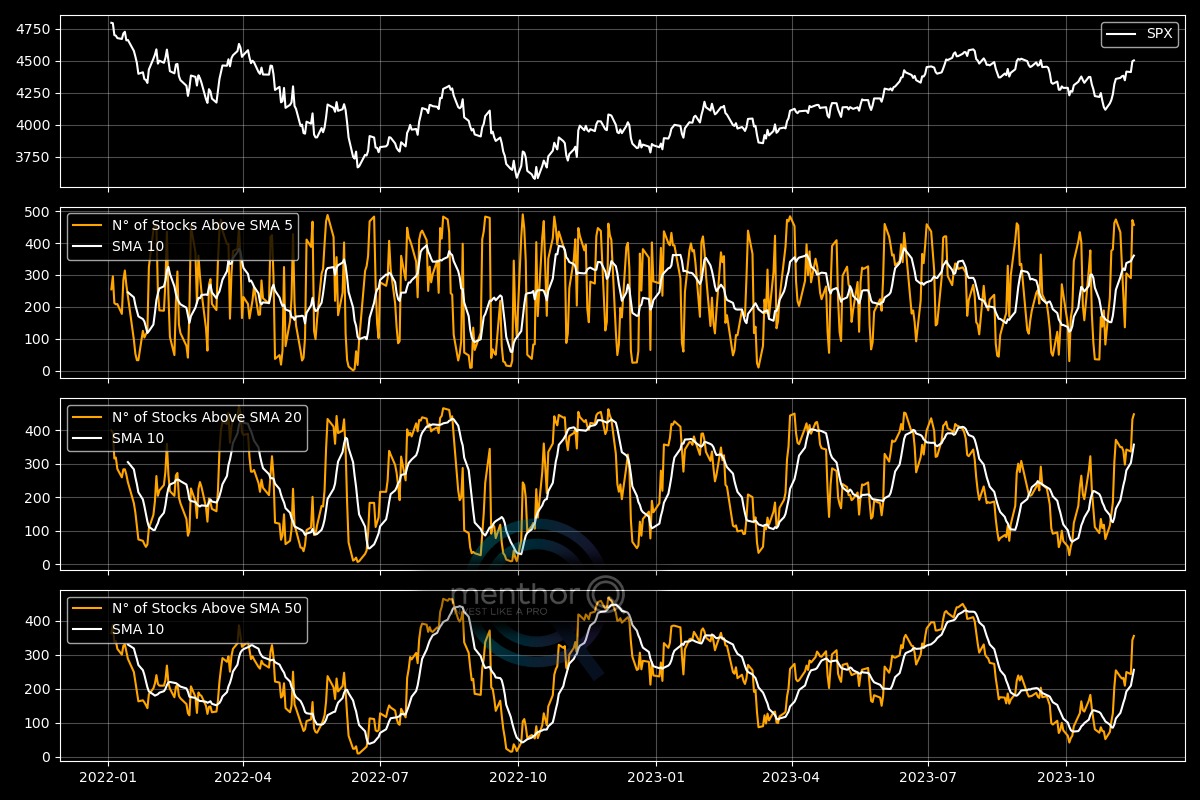
Similar to the Market Breadth that measures the number of stocks in the index above the 200-day moving average, this indicator looks at shorter term moving averages. It comes in a 4 panes chart:
- Price of the Asset
- Number of Stocks above the 5D simple moving average
- Number of Stocks above the 20D simple moving average
- Number of Stocks above the 50D simple moving average
This is how we can read the indicator:
- If a large number of stocks are above their short-term moving averages (like the 20-day or 50-day SMA), it suggests broad market strength and positive momentum, indicating that many stocks are participating in an uptrend.
- If few stocks are above their short-term moving averages, it may imply market weakness or bearish momentum.
- Significant changes in the number of stocks above their short-term moving averages can signal potential trend reversals. For example, if there has been a bear market or correction and suddenly a large number of stocks begin to rise above their short-term MAs, it could suggest the beginning of a market recovery or a bullish reversal.
Menthor Q MACD Indicator
The Moving Average Convergence Divergence (MACD) is a trend-following momentum indicator that shows the relationship between two moving averages of a security’s price. The MACD is calculated by subtracting the 26-period Exponential Moving Average (EMA) from the 12-period EMA. The result of that calculation is the MACD line. A nine-day EMA of the MACD called the “signal line,” is then plotted on top of the MACD line, which can function as a trigger for buy and sell signals.
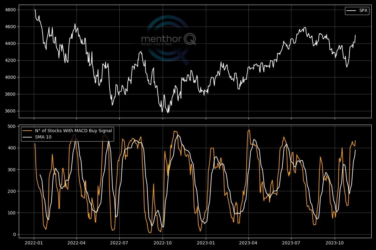
The MACD Indicator measures the number of stocks in the index with a MACD Buy Signal. The MACD Buy Signal occurs when the MACD Line Crosses Above the Signal Line. When the MACD line (the difference between the 12-day and 26-day EMA) crosses above the signal line (the 9-day EMA of the MACD line), it suggests a potential bullish trend and may indicate a good time to buy.
You can access these Models and Charts within our Premium Membership.
